
When the web design experts at 101 Management, Inc., create a website for your business, one of the most critical design elements we take into consideration is the Call-To-Action (CTA). This is the important section that asks your visitors to do what you want them to do: buy your product or service, sign up for a subscription, request a free quote, etc.
You can have a beautiful website, with fast-loading pages, that are full of current, interesting information, but if your CTA is difficult to find or not compelling enough, visitors may click away without taking any action at all. This lowers your conversion rate (the ratio of visitors to buyers) and ultimately costs you money.
What Makes a Great CTA?
Planning
When we’re working with you to design your website, one of the first things we’ll discuss is your objective for the site. That is, what do you want visitors to do when they arrive? You may have several goals for your visitors. These should be ranked in order of importance. If you have a product or service to sell, that should be your #1 priority. You may also want to obtain their email address or sign up for your newsletter. Decide ahead of time what actions you want from your visitors. This will help you decide on the placement of your CTA button(s).
Placement
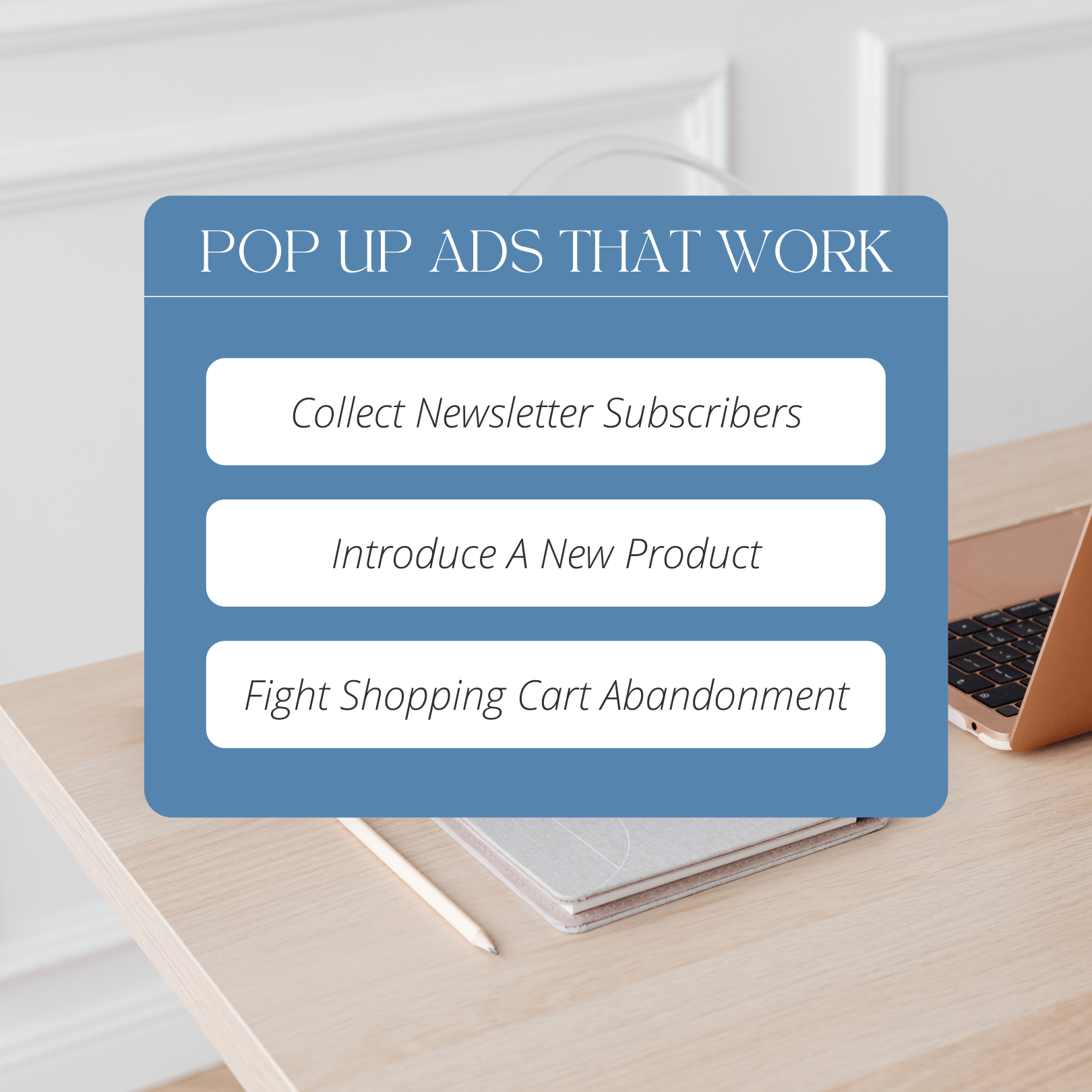
Effective placement of the CTA could be a course in itself. The most important CTA should be more prominent than any others, easily found, and highlighted properly. Depending on the design of your website, the ideal place for your main CTA could be at the top (center, right, or left) of the page, center of the page, or the bottom. It could also be featured in an overlay (a type of ad that appears to be three-dimensional, hovering above the copy on the page), or in a pop-up (an ad that suddenly appears in the viewer’s field of vision). These are the kinds of decisions our web design experts can help you make.
Appearance
As we’ve mentioned, the CTA should be immediately obvious to visitors. There are a number of ways to highlight its appearance, from the use of white areas (known as “whitespace”) as the background for buttons, and contrasting colors from the rest of the webpage. You may also devise various ways to call attention to it, such as arrows pointing to it, as you’ve seen on numerous websites.
Language
In any sales pitch, clear, concise language with powerful verbs is crucial. Donate. Contact. Enroll. Don’t leave any question as to what you want your visitors to do.
Benefits
The benefits of clicking on the CTA button should be part of the design. “Sign up today to receive your free trial membership.” “Buy now to get all three!” “Get a FREE quote today.”
Urgency
Most people have become too sophisticated these days to fall for the limited-time-offer pitch: “Offer expires at midnight tonight!” But you still need to create a sense of urgency in your visitors that makes them want to take action while they’re still on your website. One way to do that is to suggest urgency subconsciously by using words that evoke a sense of immediacy. “Buy now!” “Sign up today!”
A/B Testing
Since successful CTAs are more art than science, you will need to conduct A/B testing to confirm your hunches about placement, appearance, copy, etc. In this type of testing, you do a trial run of a single element—for instance, placement—and see whether your conversion rate improves.
For help with these or any other of the myriad elements that comprise effective web design and maintenance, be sure to contact our experts at 101 Management, Inc.


Leave A Comment