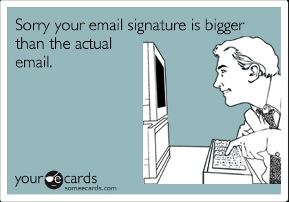
There are many different types of professional email signatures that flow into my inbox daily. Few that are on point and not annoying to everyone who sees it. Here are my suggestions on what NOT to do in your email signature:
1) SENT FROM MY iPHONE: It’s 2014, everyone has a mobile device or tablet, and most people respond to emails with them. There is absolutely no need to let us know that you don’t type well on yours and whether or not you happen to be in the office at your computer. What this really tells us is that you have no idea how to change your email phone settings.
2) EMAIL ADDRESS: This should be an obvious answer- if someone is receiving your email, they have your email address. Redundant and unnecessary.
3) IMAGES/ LOGOS: This has to be the #1 most annoying of them all. If you have a logo or image of any kind in your signature, these are delivered as attachments to your recipient. First, since there are many different types of browsers that users view email on, a lot of the time, your image will not even be rendered properly. Next issue: If you send an email and also attach an important file (document or picture of any kind), when the recipient attempts to download it, they will also download all of those little images in your signature. Therefore, adding a pile of useless data to the recipients computer, in which they must take the time to delete.
4) BRAGGING/PRESS/CLIENTS: Websites are used to store information about your business, which is precisely where this information belongs. There is NO reason that you should ever need press links or client lists in your signature.
5) QUOTES: Quotes should be left to Social Media. What is the upside for your recipients to see this over and over again? If you have one of these on your signatures, just delete it. Post it on your Facebook Profile under the section “Favorite Quotations”.
Did we miss any? Comment below and let us know!
::EM::


Leave A Comment