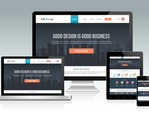
When the website designers at 101 Management Inc. design a website for you, we take into account numerous factors. In addition to such components as ease of navigation and functionality, your website must also look and perform well across all the different operating systems on all the varying platforms and devices in use today.
Another issue that most people don’t consider is the psychological impact of the overall design on buyers. The visual aspect is a large part of designing a successful website; one that induces your visitors to make a purchase or book an appointment.
As we explore the main visual elements of website design below, keep in mind that the subconscious impression you’re seeking from visitors is that of a legitimate online business. Think of your own reaction when you land on a website that may have all the information you’re seeking and the goods or services you want to buy, but looks like it was cheaply built or from 1999. Don’t you hesitate to click the buy button if the site is loaded with typos, tiny type, stock photos, or ugly colors? A well-designed website solves this.
Successful Website Design Elements
1. Content
You’ve heard the expression, “Content is king.” This is certainly nowhere more true than in website design. The content of your website ultimately drives the design, but content itself must also be designed in a way that appeals to visitors. It should be neither too long, inadequate, or too confusing. It must be organized so that visitors can immediately find what they’re looking for when they arrive on your site, with many signals that help them easily navigate the site. For e-commerce website design, it should also provide informative content, so that the entire website doesn’t appear to be nothing more than an advertisement. Finding the correct balance between these two goals takes expertise.
2. Colors
Color is a vast subject in website design, with many potential landmines. Many lengthy books have been written on the subject of the psychology of color, as well as its effective use in web design. For example, did you know that out of all the colors available, only 216 are considered “browser friendly”? That is, they are the only colors that will look accurate on all the browsers currently in use.
The colors we employ in designing your website must relate to the current colors of your brand and logo, but you also need to be aware of the psychological impact of various colors. Some colors, such as orange, red, and yellow, are seen as stimulating. They can also be perceived as childish, playful, and unserious. Gray and blue are usually associated with professionalism (think of the suits bankers and politicians wear). Then there are the pastels, and the varying shades, tints, and hues of the basic colors on the color wheel. You need to decide what emotional response you want to evoke in your visitors, then select the appropriate colors to achieve that.
3. Spacing and Composition
Too many design elements, including the overuse of graphics, can be distracting, confusing, and overwhelming for visitors, causing them to click away from your website. You need to use white space effectively, and ensure that visitors can readily find the information they’re seeking, including how to purchase your goods or services. Simplicity is the key in composition.
4. Typography
Unity of font, or typeface, is one of the elements that must be considered in a successful website. Using too many fonts looks amateurish, as does the use of cutesy or unusual ones. Another consideration is the use of space between letters (kerning) as well as the space between lines (leading), to make the content easier to read.
For all these reasons, it makes sense to engage a professional to design your website, such as the website design experts you’ll find at 101 Management Inc. Whether you already have a website that you’re not happy with, or you’re planning your first website, contact us. We will work closely with you to incorporate your vision into a website that produces the results you want.


Leave A Comment